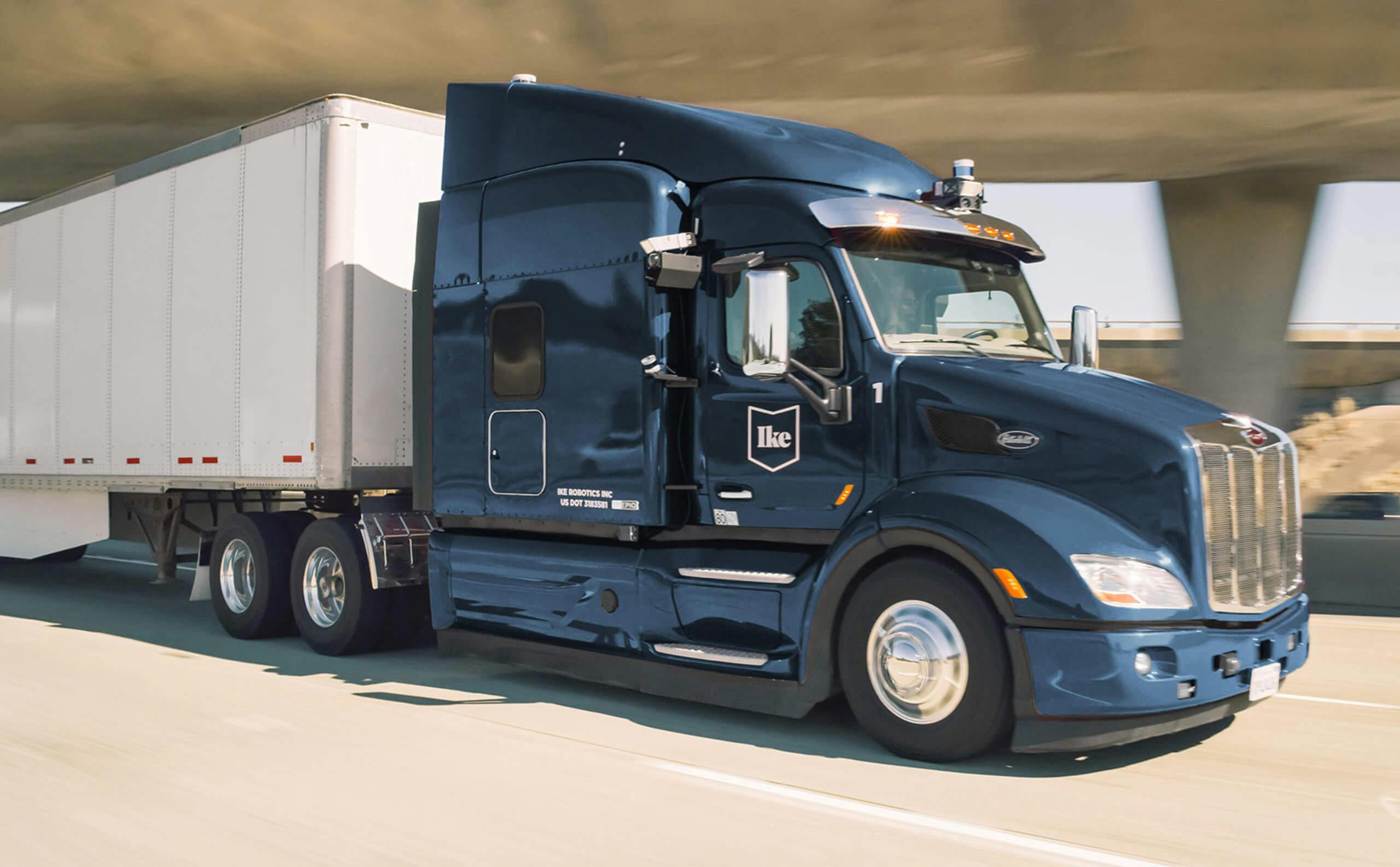
Ike developed autonomous driving technology for the commercial trucking industry and was founded by veterans of autonomous programs at Uber, Apple, and Google. Unlike many autonomous platforms, Ike did not aim for a future of robot trucks. Instead, using transfer hubs where trucks would shift from local driven cabs to interstate autonomous control, they focused their technology on long-haul routes—a source of grinding workloads for truckers and safety risks for other vehicles. While the startup was still in stealth mode, we created a system that references interstate signs and Americana while feeling clean and contemporary. From there we continued to work with them on a range of projects including presentations, collateral, front-end design of internal tools, and the company’s website. After receiving $52 Million in Series A funding, Ike was acquired by fellow autonomous vehicle startup Nuro in December 2020.
SCOPE
- Brand Identity
- Brand Guidelines
- Communications
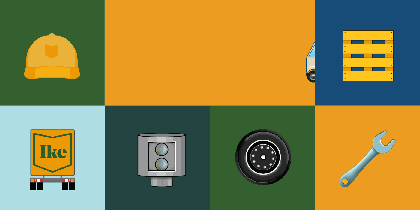
- Iconography
- Infographics
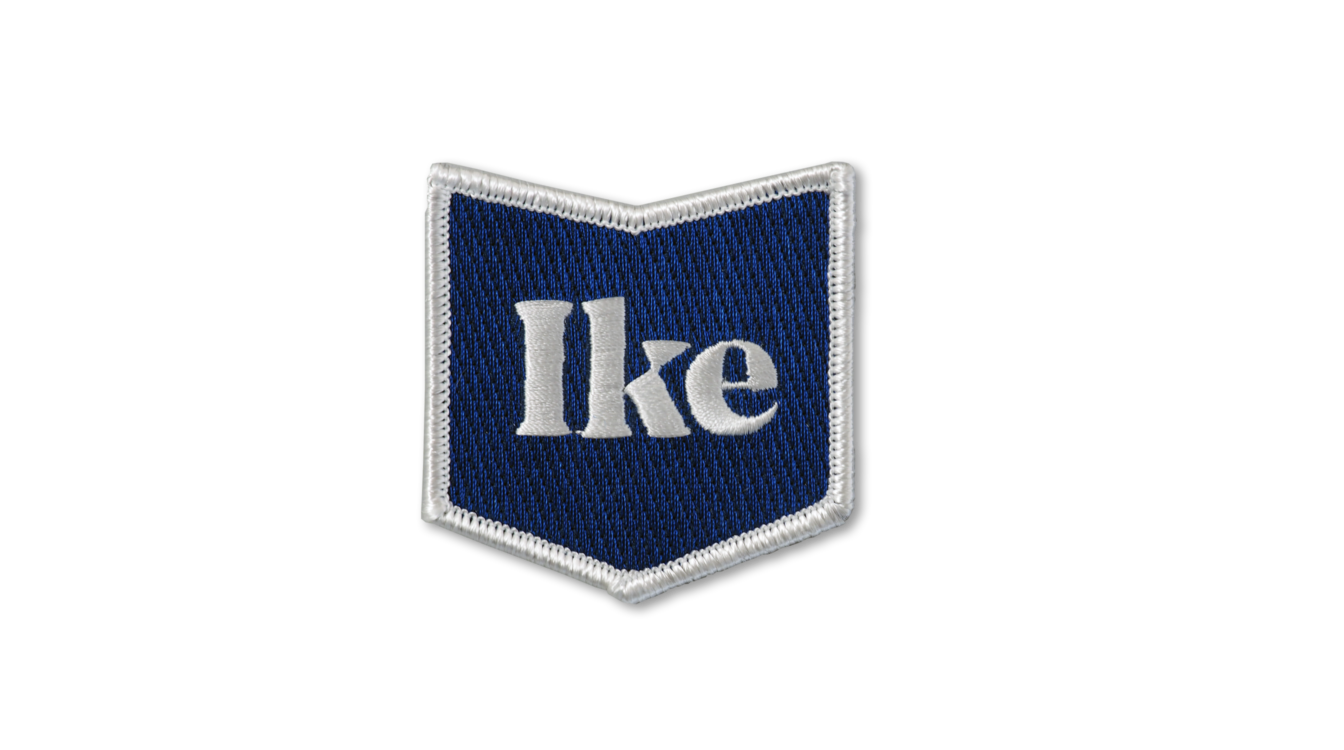
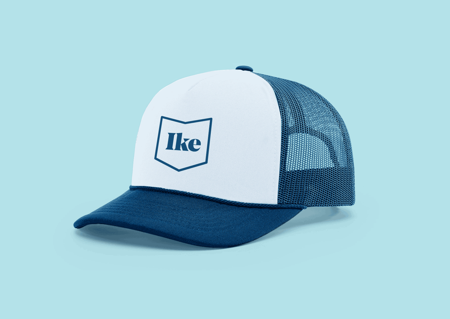
- Merchandise
- Motion Graphics
- Signage
- Social
- Website / UI / UX
PARTNERS
- Brand
- Communications/PR
- Engineering
- Founders
- IT/Data
- Marketing
- People/HR
- Recruiting
We took inspiration from sturdy American brands and the country’s landscape from the open road. We wanted the brand to feel equally at home with truckers and the engineering teams in charge of key technology. It was also important for it to feel reliable, hard-working, human, classic, and connected.
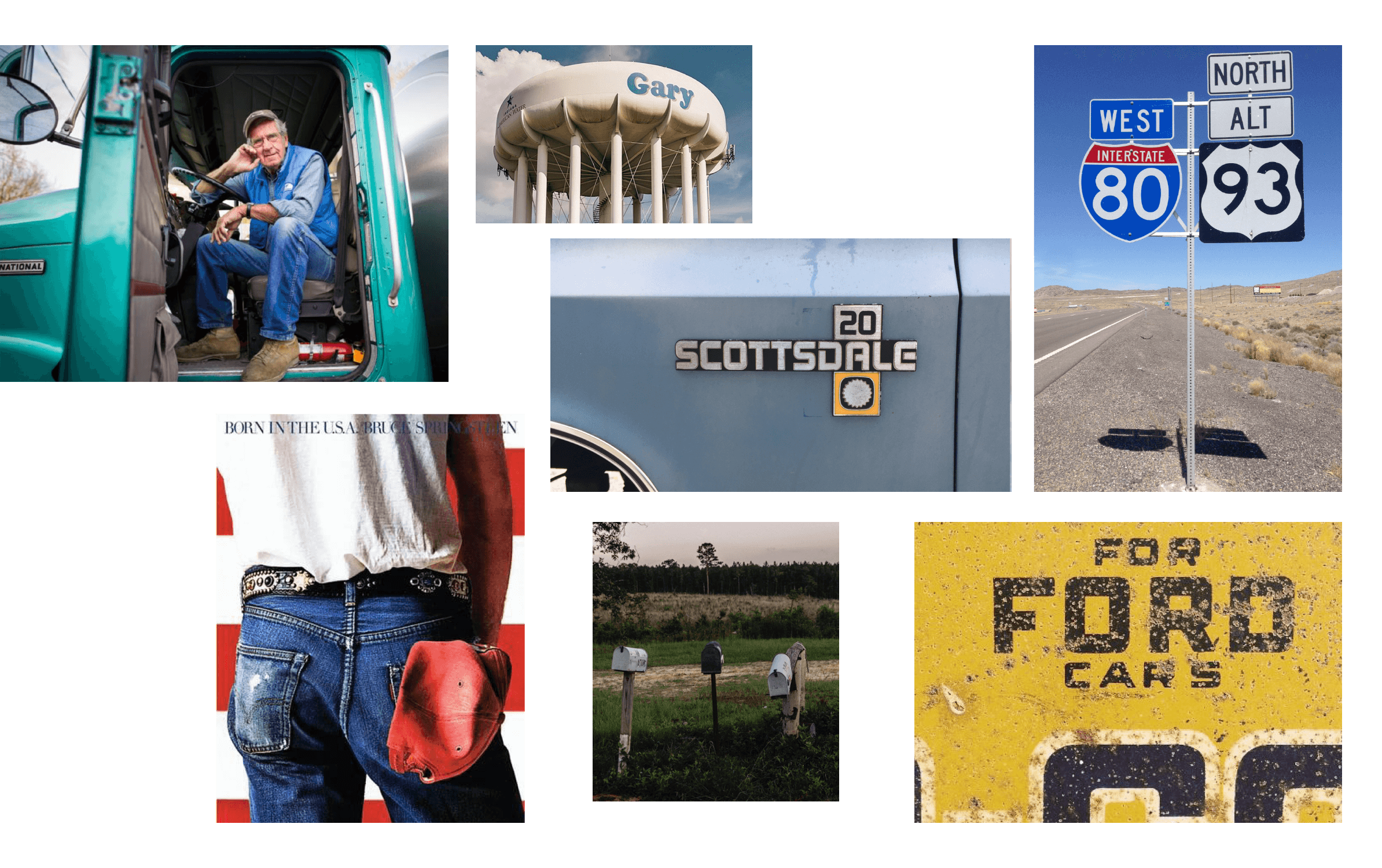
While interviewing the founders and key stakeholders as we developed scope, several creative challenges and tensions were revealed: how to stand apart from others in the automated landscape; how to reflect the trucker community without being patronizing or making a caricature of the job; how to instill trust and get buy-in from the public and policymakers for driverless trucks. As designs developed, we eliminated directions that felt overly retro or imitative, favoring those that were contemporary, flexible, and approachable.
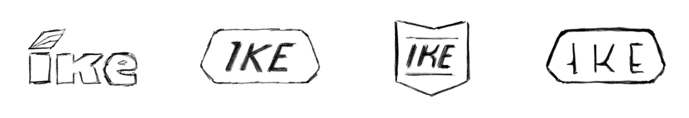
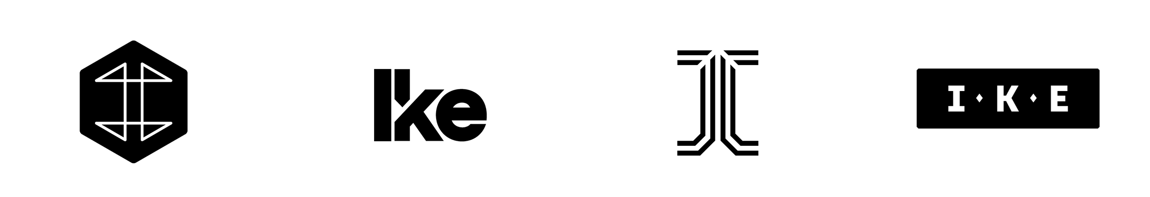
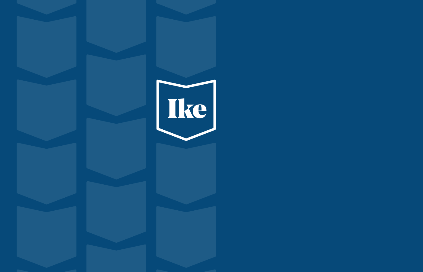
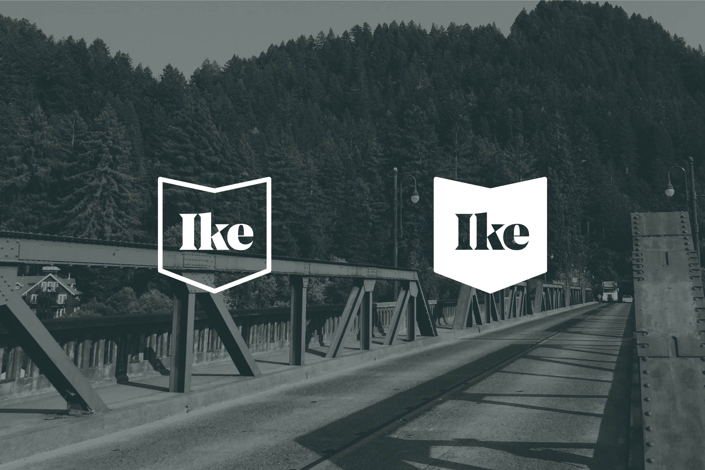
The simple and clean shield logo that was developed for Ike can appear in either a thick outlined version that offers transparency over a background, or as a solid field, allowing two simple options that offer flexibility to respond to a variety of uses.
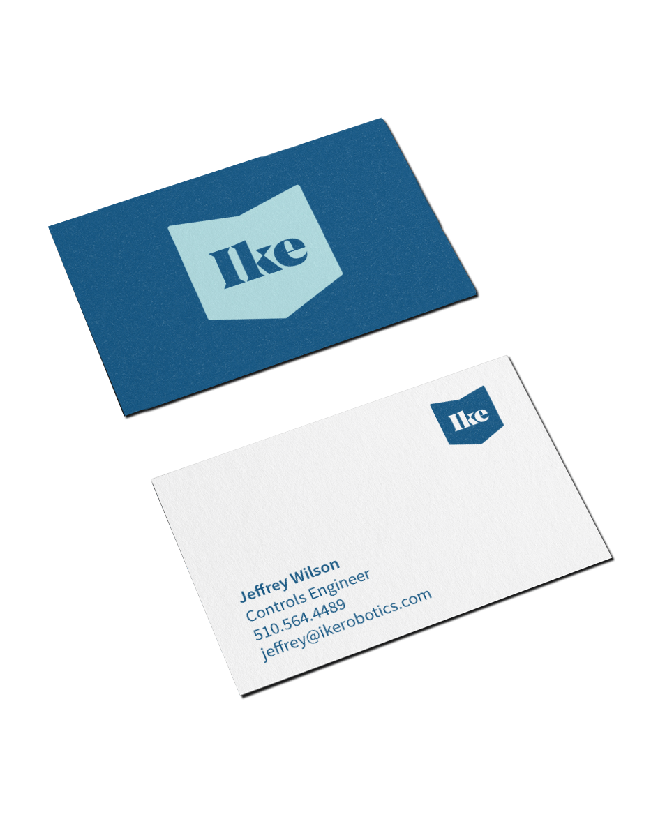
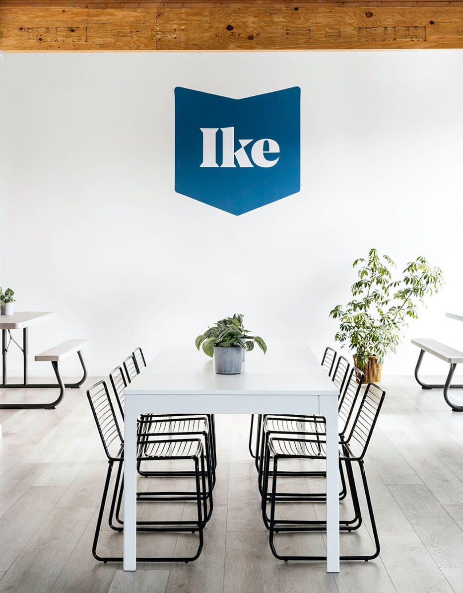
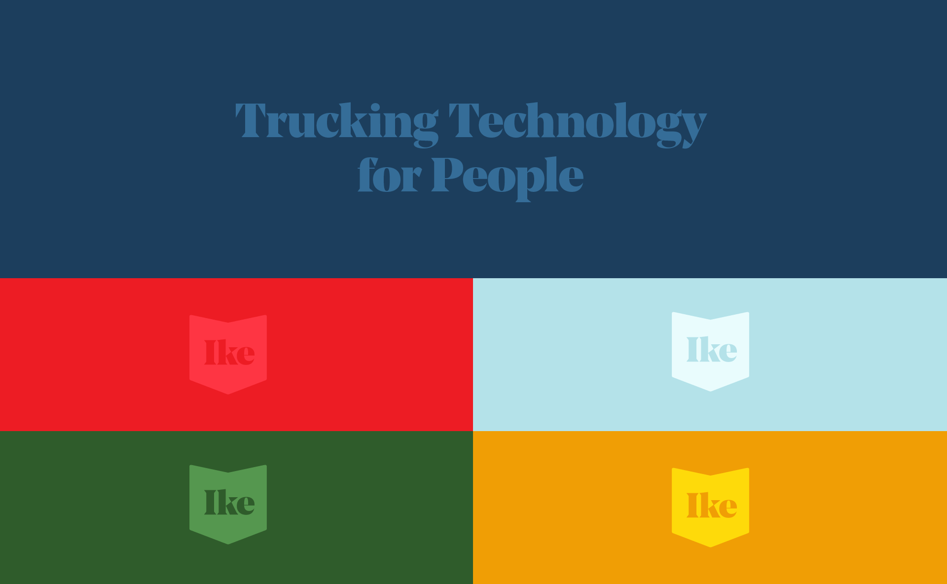
The system’s color palette pairs primary and secondary colors with a richer, deeper version of each tone, with the logo itself set in a core navy blue.
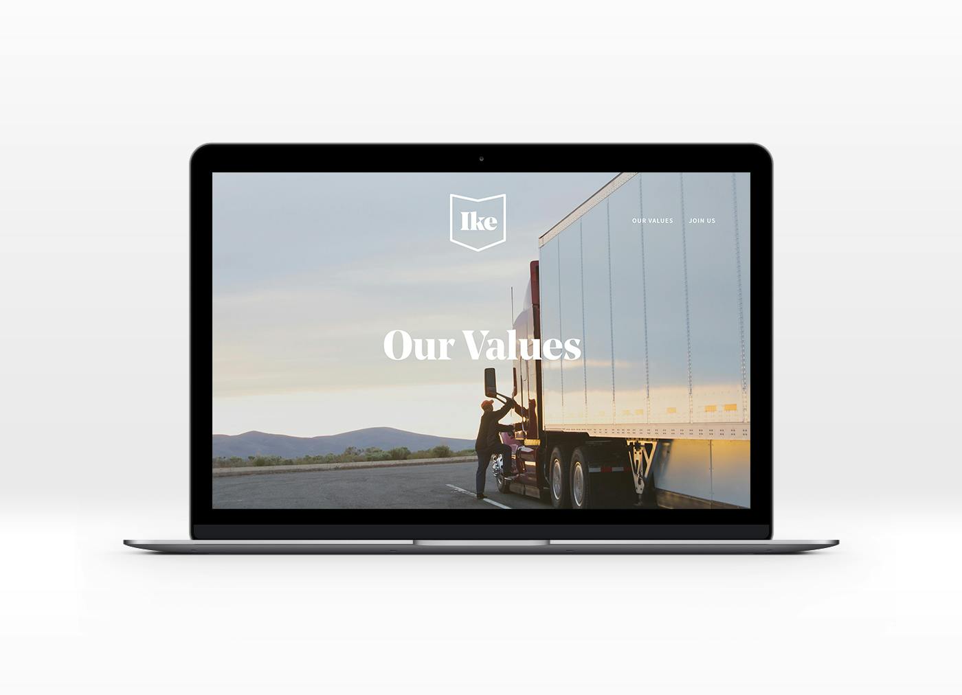
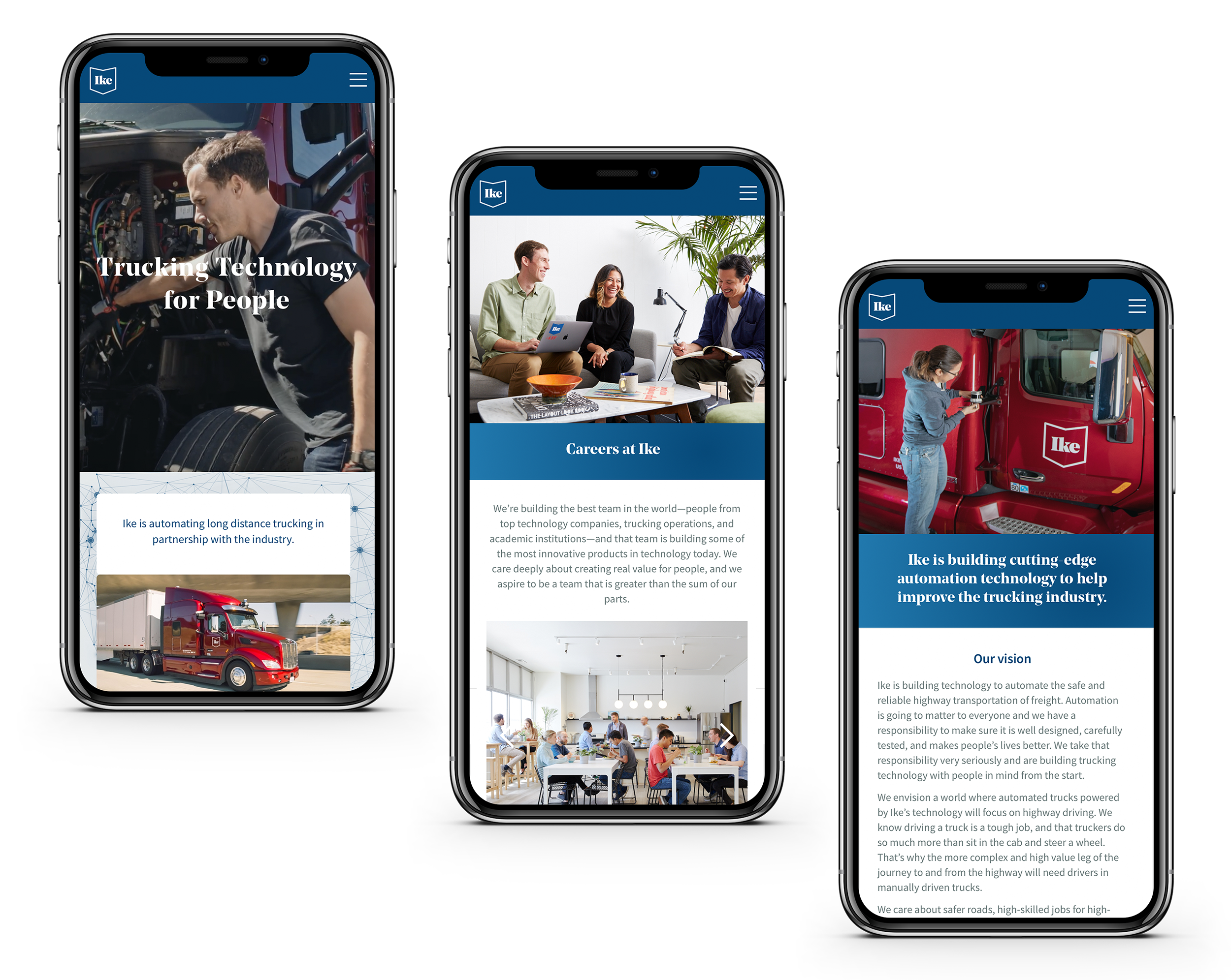
We developed Ike’s website in two stages—first a bare-bones pre-launch site expressly created for recruitment. Then as the start up moved out of stealth mode a second site was created with a fuller image of the company.
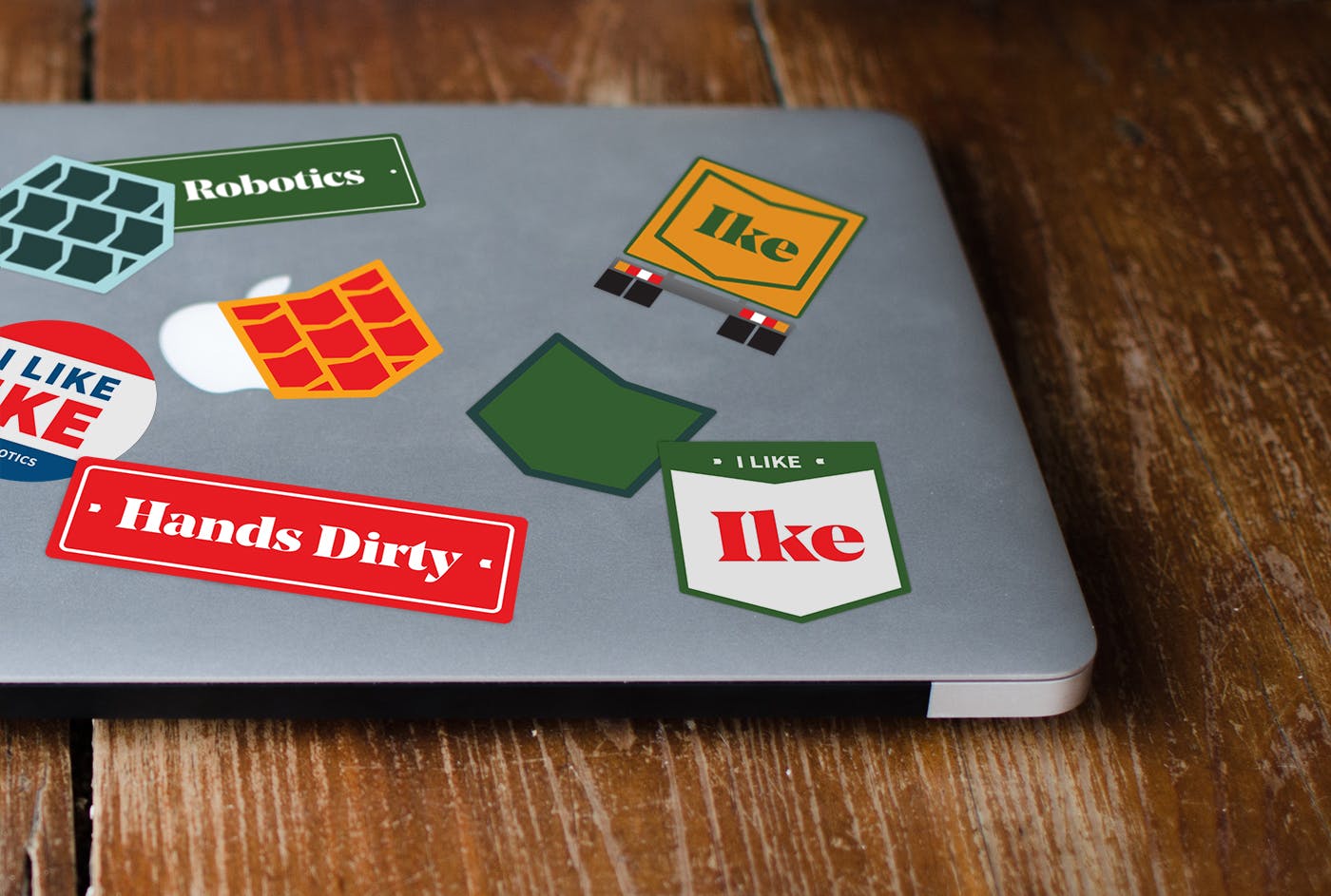
In addition to Ike’s branding and website, we designed a variety of other materials and communications—including team swag, Slack emojis, corporate governance white papers, presentation deck templates, and the ever-important startup laptop stickers. Materials that would help build their company culture and contribute to their growth and development.